As I have written before, I have had a terrible time trying to figure out what colors to paint the master bedroom in our new house. The interior designer/paint color consultant helped us originally to settle on a sage green and beige color pallet. We wanted to paint three of the walls one color-the sage, and then the wall behind the bed, the beige color.
As I thought more and more about it, I concluded that we would not like the sage green color- it looked too much like fake mint chocolate chip ice cream (real mint chocolate chip ice cream is NOT green colored-it’s white. ) So I ditched that color pallet, and I started the search for new colors.
I found this color, I really liked:
I thought it would be a cinch to find a taupe/beige/tan accent color to bring out the oak window sills, door, and baseboards in the room, as well to match our medium stained pine bed.
I started posting this color on Twitter, and interior designers, and painters started telling me matching grays to beiges was REALLY hard- unless the shade was right on they said, the beige usually made the gray stand out too much. One of my Twitter pals, and former mural painter, told me to look for a yellow based beige- she said that would highlight the gray, without overpowering it.
By this time, I was completely consumed and obsessed with finding that perfect shade, which would just tie the room together, achieving bedroom Nirvana.
I spent half an hour in the paint store, looking through the beiges, tans, and taupes, and ended up with probably 50 different paint color swatches. I held them up to my bed first, and then the ones that didn’t look good next to the bed, I eliminated. Then I held the remaining colors up to the Beacon Gray sample, and if it looked good, I kept it, if not, it was eliminated. Then I held the remaining swatches- about 30 up to the bed AND the Beacon Gray sample. By now, I was thinking I was in a bad reality paint picking paint show.
After taking numerous breaks, to keep my eyes and view “fresh,” I finally was down to 10 colors, then 5, then 2, and then the ONE! It was this:
 French Manicure by Benjamin Moore
I was so happy-the search was over. The next day, I rushed to the paint store to get the sample of it, just to make absolutely sure. My plan was to paint the three walls in the gray, and still have the accent color be painted on the wall, behind where our bed would go.
I rushed out to the house, to paint my sample. As it dried, I realized it was NOT the ONE. It was too peachy. It looked like that flesh color you always wanted out of the Crayola Crayon box, to color the people in your coloring books with.
So back to the old drawing board. I called the consultant who originally helped us, and told her what was happening. She gave me only 3 accent colors to choose from, that would match the Beacon Gray. After yet another trip to the paint store, to find these colors, it was pretty easy to choose this one:
 Hepplewhite Ivory by Benjamin Moore
This really, truly, was the ONE. Even a professional said so.
On Saturday Joe started to paint our bedroom, and the Hepplewhite Ivory was gorgeous. I LOVED it. It seems more yellow on the wall, but not a juvenile yellow- just a rich, creamy, yellow- not too gold, not too light. It looked wonderful already next to the oak wood in the room.
I was leaving with the boys, as Joe started to paint, and when he got home four hours later, he was mad! He had painted two of the walls in the Hepplewhite Ivory. We had decided to do two walls in that, and two walls in the gray. He pained one wall in the gray, and said it looked awful.
I wanted to see, so even though it was 9 PM, I drove out to the house to see for myself. This couldn’t be happening!
Joe was right- the colors by themselves were pretty, but the Hepplewhite Ivory next to the Beacon Gray, made the room look like a circus room- it looks like the colors you would chose for a nursery- not a master bedroom.
I loved the Beacon Gray, but I loved the Hepplewhite Ivory more- Beacon Gray was not meant to be. So I said good-bye to it, and drove home. Joe had said he thought the room should just be the ivory color, and I told him I agreed. It really will look better with the wood in the room, and we can always add pillows or curtains to the room, if we want to add in more color.
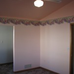
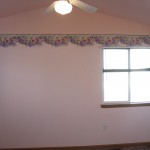
I am hoping this concludes the master bedroom paint problems. I really do love the Hepplewhite Ivory- it is a great warm and inviting color- perfect for a master bedroom. No matter what it will look better than how the room looked originally:
Yes, those are pink walls! (you can click on the pictures to see them larger-if you dare!) I can’t wait to post the ‘after’ pictures. Stay tuned, and thanks for reading this long post about paint! It is probably less exciting than watching paint dry. 🙂


